
Designing form body is the key step to create a form. In this step, you need to figure out how to structure "questions" in your form through adding & editing widget one by one. After finishing the form body or the “structure”, what remain are decorating its appearance and setting limits on "Submit" behaviors.

First of all, let us have an overall picture of this page. The body design page has three columns: left, middle, and right. The left column is the place for you to choose widgets. The middle column is the visualized form editing panel. The right column is the editing & setting panel for widgets.
Main operations in this step include the followings:
- Click to add an appropriate widget directly from the left columns or drag & drop a widget to the place you want in the middle column.
- Drag one widget to change its position in the middle form editing panel.
- Click to select one widget already in the middle column and configure its settings like question label in the right column.
Adding and editing widgets, you'll see the form coming into being in the middle form editing panel.
Middle Column - Form Editing Panel
Let's see the form editing panel first.
The panel features "what you see is what you get". Nearly every edit and adjustment towards your form will be shown in real-time in this column. From top to bottom, we could divide one form into four parts: header, body, submit area, and copyright information.

In the form design process, you may click on different parts of the middle column to edit the part you selected.
Header Area: it is located at the top of a form where you can set Form Title, Description and Logo. Clicking header area in the Veteran mode, you'll back to step one "Header" to modify its settings. However, under the Flash mode, the Form Title and Description need to be customized in the right column of the page.
Body Area: beneath the header area, you can see the main part of the form - Body. In this area, you can add widgets to the body, drag one widget in the middle column to rearrange its order, and click one widget to configure its settings in the right column.
Besides, when one widget has been selected, there will appear some function icons around it.
"Duplicate" icon: it's at the left bottom corner. Clicking the icon results in copying the selected widget. You can also duplicate one widget by clicking & holding the left mouse button to drag & drop the widget while pressing "Ctrl" key.
"Remove" icon: when you hover mouse over a widget, this icon appears at the top right corner of the widget. It can be used to delete a widget.
"Squeeze up" icon: this icon is located at the top middle edge. It can adjust the position between widgets so that the layout of the form will be more compact. Generally, one widget takes up a single row. Squeezing Up, as its name implies, juxtaposes one widget with the above widget to the same row. One row allows 4 squeezed widgets at most. Each squeezed widget shares the same width and can be swapped left or right.

 Submit Area: submit area is adjacent to form body part. It's the place where we put "Submit" button. Clicking this area, you're able to customize the text of the button, e.g. from "Submit" to "Confirm" or "Register". More settings for the Submit area (such as button width, text alignment, and background image) can be configured at the next step "Appearance".
 Copyright Area:
Copyright information is right under the Submit button. Its default layout is the logo of MikeCRM and the text "Powered by MikeCRM". You may click this area first and then edit it at the right panel, where you could insert your organization name into the text "Powered by MikeCRM for ***" or insert your logo by buying the Custom Brand Logo extension package.
Left Column & Right Column – Widgets & Widget Settings
The main body of a form is consisted of various widgets. Right here, let's have a tour to get familiar with the widgets provided by MikeCRM and the widget settings you can configure.
Form Widgets
Form widgets can be classified into four categories: basic widgets, image widgets, auxiliary widgets and contact widgets.
Basic Widgets
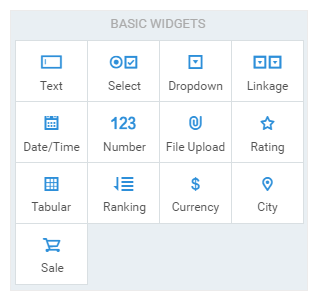 Text: similar to the "fill-in-the-blank" questions in test papers, textbox is one of the most commonly-used widgets with widely presence in various scenarios. Text widget is intended for typing in single line text or paragraph texts. Switching from single line textbox to paragraph text enables the textbox to have a larger typing area that collects more text. Meanwhile, in the filling settings, checking the "No duplicates" will restrict Submits from the same value while checking the "Character limit" will set the maximum number of characters allowed. What's more, you can use RegExp (Regular Expression) to ensure the validity of the text, for example, specifying the text format to be email addresses or ID numbers only.
- Select: just like the choice questions in test papers, Select widgets are presented in all kinds of polls. You can switch select type among Radio, Checkbox and Dropdown list. The options in the three select types can be edited in bulk. In the course of bulk edit, you can choose option templates from Predefined Options. It's also available to rearrange options' sequence and set option limits to control the number of times an option can be chosen.
- Dropdown: dropdown list is a variant of radio button. They both have several options and only one option is allowed to be selected. Dropdown differs from radio button in two aspects: the options in dropdown are folded by default to save space, and dropdown widget has an additional setting Placeholder, allowing you to customize the default instructive text to be shown.
- Linkage: the most common linkage is the multi-level dropdown list "Country-State-City" used to select addresses. Only after one state in the first dropdown level has been chosen, the cities under the state in the second dropdown level will be displayed then, namely a whole-part structure.
- Date/Time: this widget allows people to select or fill in date or time. Since the order and format of date/time varies greatly by regions and countries, you'd better set a widely-accepted date/time format. Besides, you can limit date/time range allowed to be chosen from. When someone clicks on the date/time widget, a date/time picker will pop out for him or her to select date/time. Besides, he/she can directly enter a right data/time format like "2016-09-21 18:00:00".
- Number: number widget can be regarded as the textbox that collects numerical data only. You can configure the filling settings like whether decimals/negative numbers are allowed or not, and limiting number range. Moreover, number widget supports to be placed with text (unit) inside the input box at right, which expands its daily usage scenarios.
- File Upload: this widget enables people to upload a file or files to your form. You can restrict acceptable file type, limit file size and allow uploading more than one files.
- Rating: rating widget lets people evaluate a statement on a scale of icons like stars, smiles etc. You can choose different icon and customize its scale.
- Tabular: a tabular widget looks like a table which integrates questions that share the same options. By doing so, people can use one set of column options to evaluate one or more row questions, while each row is an independent question.
- Ranking: this widget allows people to rank the options based on a certain standard or requirement. It can be used to collect people's preference towards several options or to act as an exam question that compares mountains by their elevation.
- Currency: currency widget is similar to number widget, but currency widget specializes in inputting price and needs to be specified with a currency symbol.
- City: city widget provides two different input methods. The first method is to choose city from the multi-level dropdown lists "country-state-city". Another is to input the city manually with system's guessing city.
- Sale: sale widget is indispensable if you want to collect orders online. Adding it, you can write product descriptions, set product prices, and enable customers to place orders in your forms.
 Text: similar to the "fill-in-the-blank" questions in test papers, textbox is one of the most commonly-used widgets with widely presence in various scenarios. Text widget is intended for typing in single line text or paragraph texts. Switching from single line textbox to paragraph text enables the textbox to have a larger typing area that collects more text. Meanwhile, in the filling settings, checking the "No duplicates" will restrict Submits from the same value while checking the "Character limit" will set the maximum number of characters allowed. What's more, you can use RegExp (Regular Expression) to ensure the validity of the text, for example, specifying the text format to be email addresses or ID numbers only.
Image Widgets
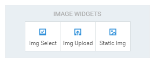 Image Select: Image Select widget enhances the Select widget by displaying options with images. You can upload one image from your devices or use online. Similar to Select widget, its type is switchable between Radio and Checkbox. Moreover, you can adjust the layout between the text and the image of options.
- Image Upload: this widget enables people to upload images to your form. Its function is similar to that of File Upload but it only permits people to upload image. In addition to image size limit, you can specify the width and height range to limit the resolution of the uploaded images.
- Static Image: it allows you to insert images in your form. One static image widget can be placed with four images at most with plenty layouts available.
 Image Select: Image Select widget enhances the Select widget by displaying options with images. You can upload one image from your devices or use online. Similar to Select widget, its type is switchable between Radio and Checkbox. Moreover, you can adjust the layout between the text and the image of options.
Auxiliary Widgets
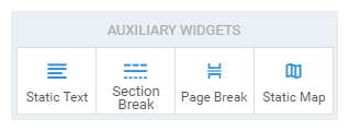 Static Text: using it, you can insert paragraphs of plain text to describe something. Hyperlinked text is also available.
- Section Break: you can insert section break to start a new section. It's displayed as a line at first and you can add text above or below it.
- Page Break: don't like one page that contains too many elements or don't want users to read all the information at the same page? In both cases, you can insert page breaks to let people follow your design pattern and read through the form page by page.
- Static Map: we embed BaiDu Map plugin into the Static Map widget for you to mark and show a location in the map.
 Static Text: using it, you can insert paragraphs of plain text to describe something. Hyperlinked text is also available.
Contact Widgets
 If one form contains any contact widget, the system can create contacts automatically, namely saving the information filled in the contact widgets as the contact information of the related customers. This is why each contact widget corresponds to one information item of the contact. Contact widgets cover various basic information of a contact: Name, Mobile Phone, Email, Organization, Department, Job Title, Portrait, Title, Gender, Birthdate, City, Address, Website, Landline, Fax, Instant Messaging Accounts (e.g. WhatsApp, Skype), and Social Networking Accounts (e.g. LinkedIn, Facebook).
Widget Settings
There are plenty of widgets and different widgets have different settings. We're going to publish a series of articles and use cases to introduce the best practice of the form widgets. In this article, let’s go through several basic and common settings first.
Switch Widget Type
 Widgets (e.g. Text, Select, Dropdown, and Image Select) allow you to switch widget type. You can switch sing line textbox with paragraph, and change Select widget type between Radio and Checkbox. By switching, you could replace one widget type with another and keep the text content unchanged.
Question
Question is the title of one widget, supporting plain text only. You can press the "Enter" key to input question in new lines.
Instructions for user
Instructions for user is under the Question. It usually adds extra information to the Question with a less conspicuous text style. You can hyperlink any text in the description area by clicking the hyperlink button and customizing the example link {{LINK[A Link](http://www.mikecrm.com)}}. For example, replacing the text in "[]" with your text and the URL in "()" with your link. When someone visits the form and click the hyperlink, he or she will be redirected to the webpage specified by you.
Required
If you make a widget required, the question will be marked with a red asterisk. When someone submit a form with a required question left empty, he or she will not submit successfully but be alerted with an error message. To ensure form-submits contain some indispensable information, just check the "required" option for the question.
Add to Contact's Note
This option is only available under the Veteran mode. It's a feature that connects contacts with form-submits. In general, every basic widget has the setting "Add to Contact’s Note". When checked, the content filled in this question will be automatically synced to the contact note, which can be viewed conveniently in the Contact Details page.
Widget Width
Widget width is decided by its ratio to the form width. Widget width has 10 levels and each level accounts for 10 percent of the form width.
Columns for Options
You can set the number of column for the options displayed in the Select widget and the Sale widget from one column to four columns.
Tips: when you switch from Veteran mode to Flash mode, these settings you've configured will be saved and remain effective while many advanced settings of widgets will be hided.
Global Settings
 At the right column, there are global settings above the widgets settings. Using global settings, you can configure Form Language, Number each question, and do other settings such as "One Submit for one person", "Create a Contact", "Grouping/Tagging", "Notify me or other participants when a new Submit comes" etc. (These general settings are also available in other steps, so we're not to go into details right here.)
Tips: form language gives people some alert messages such as the error messages for required questions. The default setting is "Follow Visitor" which will automatically set up form language based on the IP addresses of visitors. Of course, you can choose a fixed form language instead.
Form Design Workflow:
① Header ② Content ③ Appearance ④ After Submit ⑤ Global Settings ⑥ Release