
Clicking the green button “New Form” at the top right corner on the Form Manager page, you'll start the journey to create a form.
After the click, you’ll see the pre-design page, where you could rename the form, group the form and choose to start with a blank form or a template. Form names will be displayed in the form list, so it will be much more convenient to distinguish and manage forms if you change the default form name “New Form” to the one you desire. In our template center, we’ve prepared plenty of exquisite and practical form templates that suit to various usage scenarios, which can be searched and found on the basis of function categories and specific industries. Using these templates, you will find how easy and efficient it is to build an awesome form.

Completing the pre-design settings, you’ll move to the “Header” design part, the first step to design a form in the Veteran Mode.
Let’s see the “toolbar” at the top of the page first. As you may have noticed, the function menu has shrunk to the left menu button and been replaced by a toolbar.
The toolbar shows the streamlined steps to create a form. Clicking a step on the toolbar allows you to edit form elements and settings in the selected step. On the left side of the toolbar, a “flash” icon may attract your attention. It’s the place to switch form design mode between Flash and Veteran. The Flash mode only keeps two steps (“Edit” & “Release”) and some basic settings. Switching to the Veteran mode, you'll enjoy far more form features and settings. After clicking the “ ” style icon at the right side of the toolbar, you’ll see a popup window named “Form Extension Packs”, within which you can turn on or buy form extension packs to enhance the performance of your forms.
Besides, there are Redo button, Undo button and Preview button at the upper right corner. Undo/Redo allows you to reverse the effects of the most recent 10 operations while Preview enables you to see what the form will look like on a computer or a mobile phone.
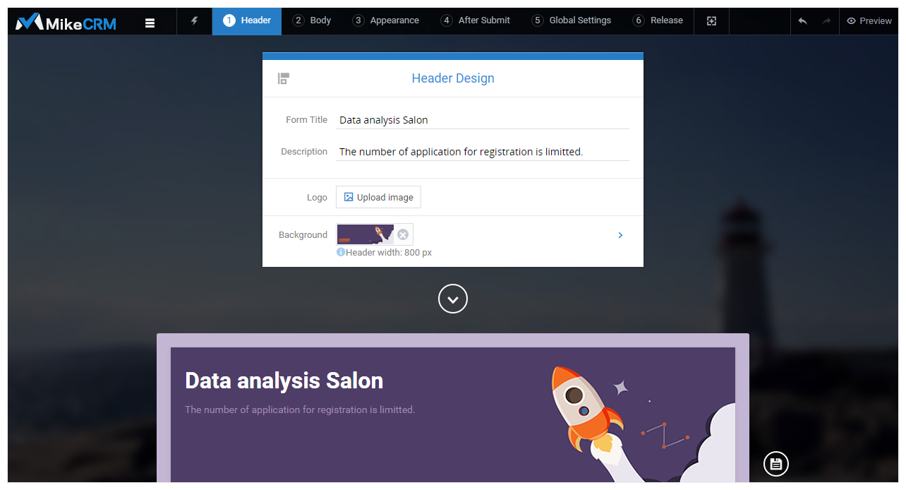
There are four editable elements in the header: Form Title, Description, Logo, and Background image.
Form Title: by default, the form title shares the form name that you set on the pre-design page. You may rename the title if you have a better one in mind.
Description: description is below the form title and works like a subtitle that adds supplementary information to the title.
Form Title and Description only support plain text. You may press “Enter” to input text in a newline while the font color, font size and bold of the text can be customized in the Step 3 “Appearance”.
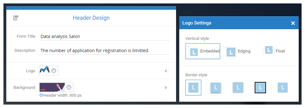
Logo: when you’ve uploaded a logo image, you can click the arrow at the right to adjust the logo’s vertical position (Embedded, Edging, and Float) and border style (None, Shadowed, Glow, Black, and White).
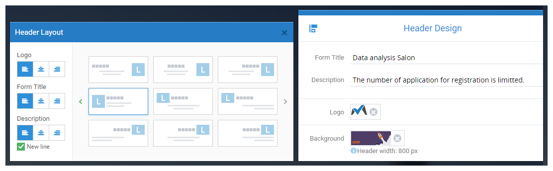
Layout: If you would like to modify the alignment of the Form Title, Description and Logo, you may hit the “Layout” icon at the upper left corner of the header panel where the three elements can all be aligned left, center and right respectively.
Background Image: If you begin with a blank form, we’ll set a default background image for you, namely the light-blue line at the bottom of the header. The line is made from a 1*5px image with repeat aligned horizontally and bottom aligned vertically. You may upload an image for the header background and set its horizontal & vertical alignment as you wish.
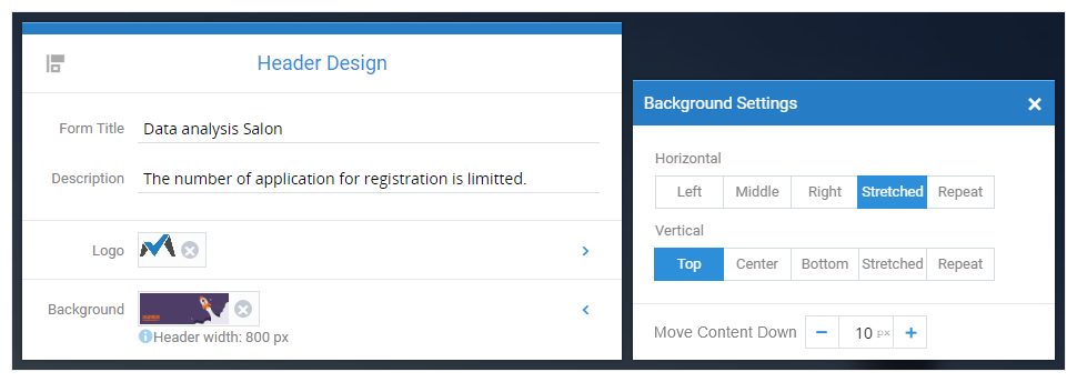
It’s very easy to understand the effects of aligning the image left, center, right, top, or bottom, since all of them only adjust the horizontal or vertical alignment with the original image size unchanged.
Showing a background image as stretched means the image will be stretched to the height or the width of the form header. The height of the form header is decided by the existing elements (namely Form Title, Description, and Logo), while the width of the header is the same as the form width configured (800px by default). Using stretched alignment usually changes the aspect ratio of the image and distorts the image, but it ensures the image to fill the entire header background.
Repeat is another alignment style that displays an image to the whole header background. If you’ve uploaded a small image as header background, repeat alignment will display the image repeatedly in the blank area without changing image’s height & width nor distorting the image. Although there might be discernable gaps between images, using repeat alignment will definitely improve the load speed of forms since small repeated images save considerable band width.
Below the header design panel, you’re able to preview the header appearance in real time. Now, let’s learn header design from some examples~
Form Design Workflow:
① Header ② Content ③ Appearance ④ After Submit ⑤ Global Settings ⑥ Release